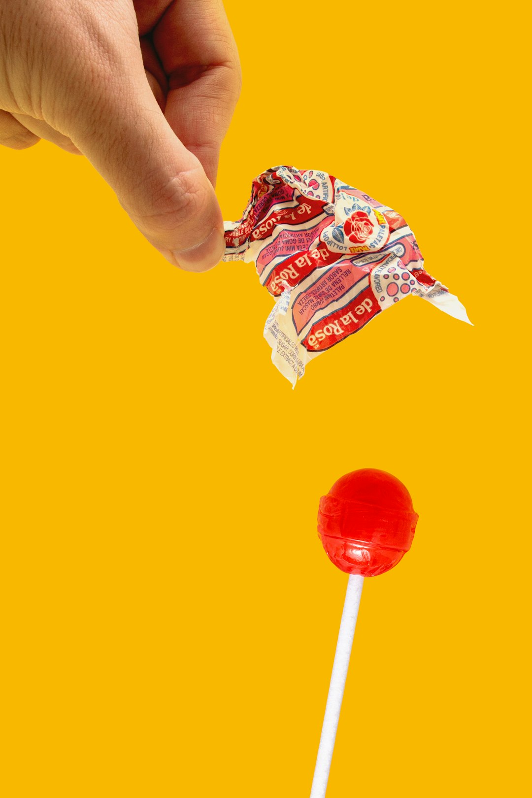
When you think of lollipops, one name that immediately comes to mind is Chupa Chups. These sweet treats have been a favorite for generations. But besides the candy itself, there’s one thing everyone remembers—the iconic logo. Did you know the design was created by a world-famous artist?
TLDR: The Chupa Chups logo was designed by surrealist artist Salvador Dalí in 1969. He created a playful, flower-shaped design that still appears on the wrappers today. The logo helped turn Chupa Chups into a global sensation. Its history is as fun and colorful as the candy itself!
Table of Contents
The Beginning of Chupa Chups
Chupa Chups was started in Spain in 1958 by a man named Enric Bernat. He had a simple idea: make candy easier for kids to eat without sticky hands. So he put a piece of sweet, fruity candy on a stick. Just like that, the modern lollipop was born!
The name “Chupa Chups” comes from the Spanish word chupar, which means “to suck.” The catchy name helped the brand stand out. But as it gained popularity, Enric Bernat wanted more. He knew a strong logo could make all the difference.
Calling in an Art Legend
In the late 1960s, Chupa Chups was doing well in Spain. But Bernat wanted it to look even better. He wanted a logo that was fun, timeless, and global. So, he made a bold move. He asked Salvador Dalí—yes, that Salvador Dalí—to design it.
Dalí was one of the most famous artists of the 20th century. He was known for his surreal paintings, like the melting clocks in The Persistence of Memory. No one expected him to join the candy business. But he said yes!
Legend says Dalí designed the logo in under an hour. He wanted something that “popped” and looked cheerful. So he created a bold, yellow daisy shape and placed the brand name in the center using red letters.
The result? Instant classic.
What Makes the Logo So Special?
Dalí’s design stands out for a few reasons:
- It’s simple: Just a flower shape and the brand’s name.
- It’s bright: Yellow and red make it eye-catching.
- It fits the wrapper: Dalí suggested the logo go on top of the wrapper, so it’s always visible.
The logo was a big hit. It gave Chupa Chups a unique style. Kids and adults all over the world recognized it. Even as the candy flavors changed and expanded, the logo stayed the same.
It’s not often you find a candy logo with a famous artist behind it!
Chupa Chups Goes Global
With a strong logo in place, Chupa Chups went international. During the 1980s and 1990s, the brand exploded in popularity. Kids from Japan to Brazil were enjoying the sweet flavors—along with Dalí’s flower-shaped logo.
They even launched fun taglines like “It’s fun to suck” to go with their bold design. From TV to comic books, Chupa Chups knew how to grab attention.
Alongside the success, the logo remained untouched. That unique yellow flower and red font became a trusted symbol. You knew you were getting a quality lollipop when you saw it.
A Logo That Lasts
Since Dalí’s design debuted in 1969, not much has changed. That’s part of the charm. While some brands update their logos every few years, Chupa Chups stayed true to the original.
Why? Because it works. The logo captured the brand’s joyful spirit. It didn’t need big updates or tweaks.
It also shows that great design is timeless. Even decades later, people still smile when they see it.
Fun Facts!
- The logo design only took Dalí about one hour to complete.
- It’s one of the few logos in the world created by a world-famous painter.
- Chupa Chups are sold in over 150 countries.
- The name “Chupa Chups” is so catchy that it’s often used to describe lollipops in general in some places.
The Power of Branding
Chupa Chups shows how powerful branding can be. The candy is tasty, sure. But the logo adds magic. Every time someone unwraps a Chupa Chups, they see a logo made by a master artist.
It’s not just about design. It’s about emotion. The logo reminds us of childhood. Of sweet flavors. Of fun times. All wrapped into one cheerful daisy shape.
And that’s what makes it iconic.
Conclusion
The Chupa Chups logo is more than just a candy wrapper. It’s a piece of art history. With help from Salvador Dalí, the brand created a design that has stood the test of time. It shows how even a small detail—like a lollipop logo—can make a big difference.
Next time you have a Chupa Chups, take a moment. Look at the wrapper. Appreciate the art. And smile, knowing you’re holding a little piece of creative genius.