We all love music, movies, or even a good ol’ game night. And what stands between us and that sweet, sweet sound? A volume slider. But not all sliders are created equal. Some of them make us want to rip our headphones out of pure frustration.
Table of Contents
TLDR:
Some volume sliders are just the worst. They hide when you need them, or move like a drunk jellyfish. Others make it impossible to find the right volume. A good slider should be easy, quick, and feel natural — not like solving a puzzle.
What’s the Deal with Volume Sliders?
Volume sliders are everywhere — on phones, laptops, games, browsers, even smart fridges. They seem simple enough. Drag left for quiet, right for loud. But users run into trouble more often than you’d think.
Let’s check out some of the worst offenders in the land of volume control.
The Worst of the Worst: Bad UI Hall of Shame
1. Invisible Until Clicked
Ever used an app where you have to hover over a button just to make the volume appear? Then you click, and *poof!* a tiny slider shows up. But wait — as soon as you move your mouse away even one pixel, it disappears!
This kind of slider usually hides in:
- Streaming platforms
- Browser-based games
- Minimalist music players
Sure, minimalism is trendy. But if I need three clicks and ninja reflexes just to turn the volume down, it’s too much.

2. Sliders That Jump
Some sliders behave like wild animals. You try to adjust the volume just a bit, and it jumps from 20% to 90%. Or worse — it bounces around as you drag, like it’s on a sugar rush.
This usually happens when developers:
- Forget to add smoothing animations.
- Mess up touch input support.
The result? You either go deaf or hear nothing. There is no in-between.
3. Sliders Too Skinny to Touch
This is a mobile UI crime. You open an app on your phone. The volume slider is only 3 pixels wide. You’re trying to drag it with your thumb, but it’s like threading a needle wearing oven mitts.
Instead of adjusting sound, you accidentally turn off captions or change the brightness. Fun!
The Classic Mistakes
Some patterns show up again and again. Let’s break them down.
1. No Visual Feedback
You touch or click and… nothing changes. No beep. No highlight. No tooltip. You wonder, “Did it even register?” Then you check your speakers. Then your ears.
Without feedback, users guess what’s happening. That’s never good UI.
2. Volume Numbers That Lie
It says 50%. But that’s not half as loud as 100%. Some sliders are logarithmic, some are linear, and most don’t tell you which one they use. It’s like ordering medium-spicy and getting nuclear hot.
You move the slider just a little, and it jumps in volume, breaking your peace and your ears.
3. No Mute Button
How do you mute fast in an emergency? You don’t. Some apps think sliders are enough. Nope. Give us a mute button! Click once, silence. That’s the dream.

Real-Life Offenders (Sorry Not Sorry)
Let’s name-drop a few real or common design patterns, just to keep it spicy:
YouTube’s tiny volume slider
It’s minimalist, sure. But it’s hidden inside a button and requires a hover to show. On mobile, it’s even worse with weird gestures.
TouchBar volume on older MacBooks
Who thought a sliding bar with no tactile feedback was a good idea? You tap, the bar shifts under your finger, and you end up muting your Zoom meeting halfway through a sentence.
Browser games with custom UIs
Flash might be dead, but its spirit lives on in wacky custom sliders. Can’t click, can’t tap, can’t win. Bonus points if there’s no way to save your setting.
So What Makes a Good Volume Slider?
Let’s be fair. If we’re throwing shade, we should also offer ideas. A good slider should be:
- Responsive – It should react right away when you drag it.
- Touchable – Make it big enough for thumbs and clumsy hands.
- Visible – Don’t hide it like treasure. Show it when users need it.
- Clear – Tell users what level they’re at, and what changes when they adjust it.
- Accessible – Sliders should work with keyboards and screen readers too.
Bonus Round: Weird but Cool Ideas
Not all volume sliders are crimes. Some actually try something new and get it right.
Dial UI sliders
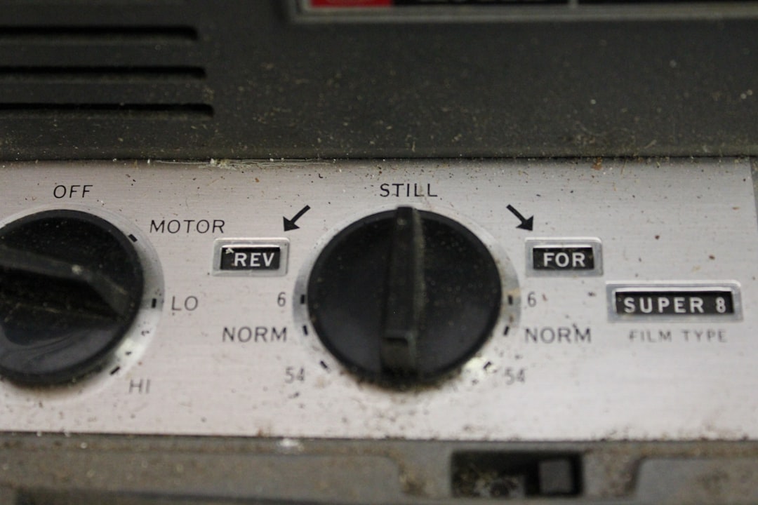
Round knobs that let you rotate like a real stereo? Neat and fun. But only if the rotation is smooth, and not like playing roulette.
Voice-controlled sliders
“Turn volume down” may feel futuristic, and hey, it’s perfect for smart home setups. But it still needs a good fallback when voice fails.
Color-coded audio levels
Some apps color the bar: green for safe, yellow for loud, red for “ouch!” It’s simple and beautiful. And also very kind to our eardrums.

Wrap-up: Let’s Not Suffer Anymore
Volume sliders might look like a small detail, but they can seriously ruin an experience. Whether you’re binge-watching your favorite series or blasting music while cleaning, a terrible slider gets in the way of joy.
Designers, if you’re reading this — think of our ears, our fingers, and our sanity. And please, please test your sliders with actual humans first.
Because no one should need a PhD in UI design just to turn the sound up.


