In a sea of digital noise, your brand’s ability to stand out begins with the smallest of visuals—your logo and favicon. Though tiny in size, these elements are essential markers of brand identity. Often overlooked or treated as afterthoughts, they are the visual anchors that reinforce your presence across websites, browsers, and devices.
Table of Contents
TL;DR
Logos and favicons may seem like small design elements, but their cohesion plays a critical role in brand recognition. A well-designed favicon that aligns with your logo enhances professionalism and consistency. This consistency is crucial for building trust and making your site easily identifiable. In this article, we’ll explore the significance of logo-favicon unity and how to design them for maximum impact.
What Is a Favicon, and Why Does It Matter?
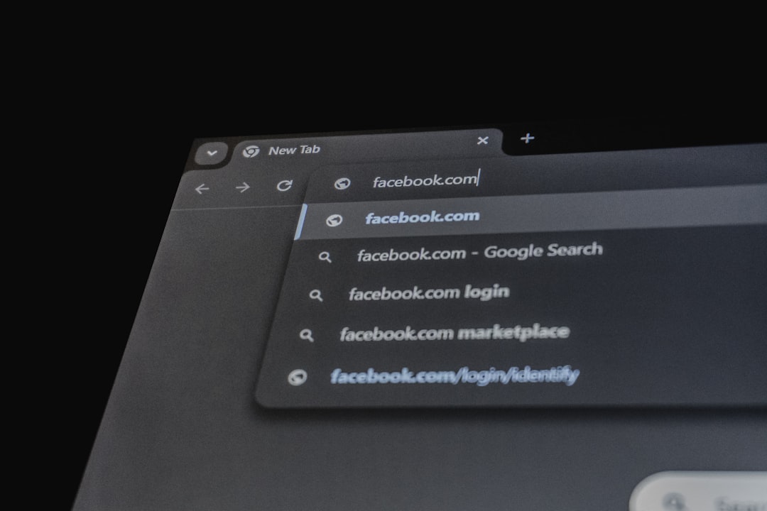
You may know your logo as the centerpiece of your brand identity, but your favicon is likely the first thing users see when they land in a sea of open browser tabs. Short for “favorites icon,” a favicon is the small square graphic that represents your site on browser tabs, bookmarks, mobile shortcuts, and more. It’s often just 16×16 or 32×32 pixels in size—but don’t let that fool you; its importance is enormous.
Imagine opening five tabs, each with a distinct icon. Which one are you more likely to return to? Probably the one with a recognizable, professional favicon. Without it, a default icon shows up, diminishing your brand presence. This seemingly minor detail is a major opportunity for brand reinforcement.
The Importance of Visual Cohesion
Your logo and favicon need to speak the same visual language. That means they should:
- Use consistent color palettes
- Share core graphic elements
- Reflect the same style and tone
This visual cohesion helps establish familiarity and immediacy. When your favicon echoes the design of your main logo, users instantly recognize your website in a busy browser lineup. That consistency contributes to a more polished and trustworthy brand presence.
Logos vs. Favicons: Understanding the Constraints
Logos serve as comprehensive identities. They are typically used in varied formats—from full-scale website headers to print materials. Favicons, however, reside in tight pixels and must be distilled to the essence of your brand.
Common challenges in favicon design include:
- Limited space: There’s often no room for text or intricate graphics.
- Cross-platform scaling: It must look good at multiple resolutions (16×16, 32×32, 48×48, 180×180, etc.).
- Browser rendering differences: Favicons appear differently depending on the browser or operating system.
Because of these restrictions, favicons are typically simplified versions of logos. For example, the “G” in Google’s full logo becomes the standalone favicon—simple, yet instantly recognizable.
Best Practices for Logo-Favicon Cohesion
Creating a harmonious relationship between your logo and favicon doesn’t have to be complicated. Follow these best practices to ensure your favicon not only aligns with your overall branding but also stands out for the right reasons:
-
Start with your Logo’s Strongest Element
Is it a letter? An icon? A shape? Use the most distinguishable feature of your logo as the basis for your favicon. -
Maintain Color Consistency
Consistent use of your brand’s color palette reinforces identity. Make sure your favicon utilizes the same primary or accent colors. -
Limit Detail
Avoid using full logos or detailed illustrations. Simplicity is key at such small sizes. -
Create Multiple Sizes
Generate favicons in multiple resolutions for sharpness across different devices. -
Test Across Platforms
Preview how your favicon looks in Chrome, Firefox, Safari, and mobile devices to ensure it’s clear and recognizable.
The Psychology Behind Brand Recognition
People process images exponentially faster than text. When users glance at a favicon or scroll past a heading with your logo embedded, they process your identity visually—and nearly instantly.
Consistent visuals across logo and favicon build an emotional connection over time. Users begin to associate your unique graphics with credibility and familiarity. This is known as brand encoding—the psychological mechanism where users mentally bookmark your brand simply through repeated visual exposure.
Examples of Cohesive Logo-Favicon Combinations
- Spotify: Its favicon uses the exact wave icon from its logo, reinforcing familiarity while remaining simple.
- Twitter (X): Despite the logo transition, Twitter’s favicon has always used its most distinctive element—the bird, now transformed into an “X.”
- Airbnb: Their favicon is a simplified version of their “Bélo” symbol—instantly recognizable and consistent in branding.
What these companies understand is the value of brand recall: small but consistent visuals lead to massive brand imprinting in the user’s mind.
The Technical Side: File Formats and Tools
Getting the format right is just as important as the design. The standard file types for favicons include:
- .ico: The most widely supported format, especially for legacy browsers like Internet Explorer
- .png: A modern, high-quality option for most modern browsers
- .svg: Scalable vector formats that adapt beautifully but aren’t universally supported
Popular tools to create favicons from logos include:
- Favicon.io: Converts text, images, or emojis into favicons
- Real Favicon Generator: Offers previews of how your favicon appears across different platforms
- Canva: For high-quality graphics that are easy to simplify and crop
Adaptability for Dark and Light Modes
Favicons increasingly need to adapt to browser themes like dark and light mode. If your favicon has a light background and is used in a light-themed browser tab, it might disappear or lose visibility.
Tips for handling theme adaptability:
- Test your favicon in multiple themes
- Use transparent backgrounds when possible
- Opt for high-contrast color schemes
Updating Your Favicon: When and How
Businesses evolve—and so should your branding assets. But changes need to be subtle and strategic. Updates to your logo or brand identity should cascade naturally into your favicon design.
When to update your favicon:
- During a rebranding or logo change
- If your current favicon lacks clarity or modernity
- To adapt to new platform requirements (e.g., mobile viewability)
Conclusion: Make Small Count
In an ever-competitive digital landscape, even the smallest elements contribute to your brand’s power. Logos may be large, but it’s often the tiny favicon—mounting quietly in a browser tab—that brings unspoken brand consistency and recognition.
Unified logo and favicon design amplify your branding, offering users not just a seamless experience but also psychological reinforcement of your company’s identity. In branding, there’s no such thing as a small detail—and these tiny icons may just be your strongest allies.