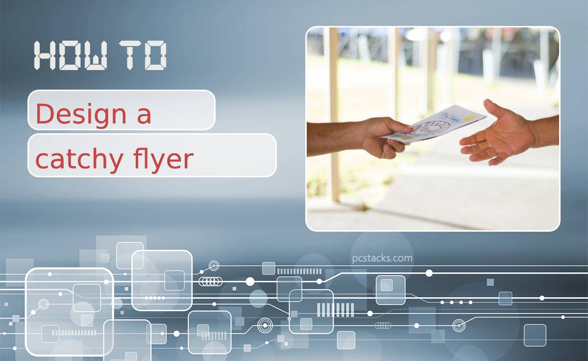
You can have the best and most creative artwork out of everybody else’s, but it is useless to design a catchy flyer if your target market cannot relate to what you are trying to sell based on your design.
Moreover, we are visual beings. We comprehend information more effectively through what we see rather than what we hear, smell, or taste. That’s why most successful advertising companies resort to a graph maker to ensure that their visual marketing efforts convert into revenue, whether promotional artworks to infographics on the web or anything in between.
How do we design a catchy, effective, and memorable flyer?
Table of Contents
Have a Clear Target
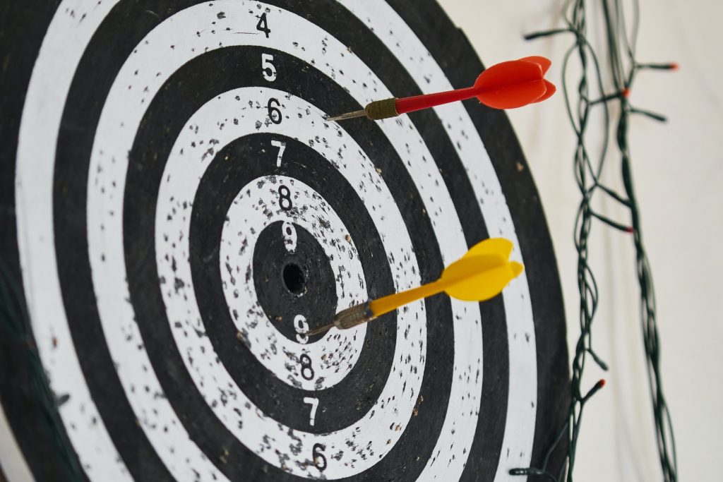
What is it that you expect to achieve from putting out an advertisement? A flyer is essentially a marketing and advertising tool that aims to promote your product or services one way or another. Before coming up with the layout, theme colors, and copy, understand and decide the goal of putting together the material.
Is it for brand awareness? Lead generation? Revenue? Whatever it may be, the first step in designing an effective flyer is to have a clear target or objective laid out.
You cannot promote the same flyer to consumers who can afford $20 worth of what you are selling compared to those who can spend at least $200. If you think you can, count your efforts pointless.
Keep It Short and Simple
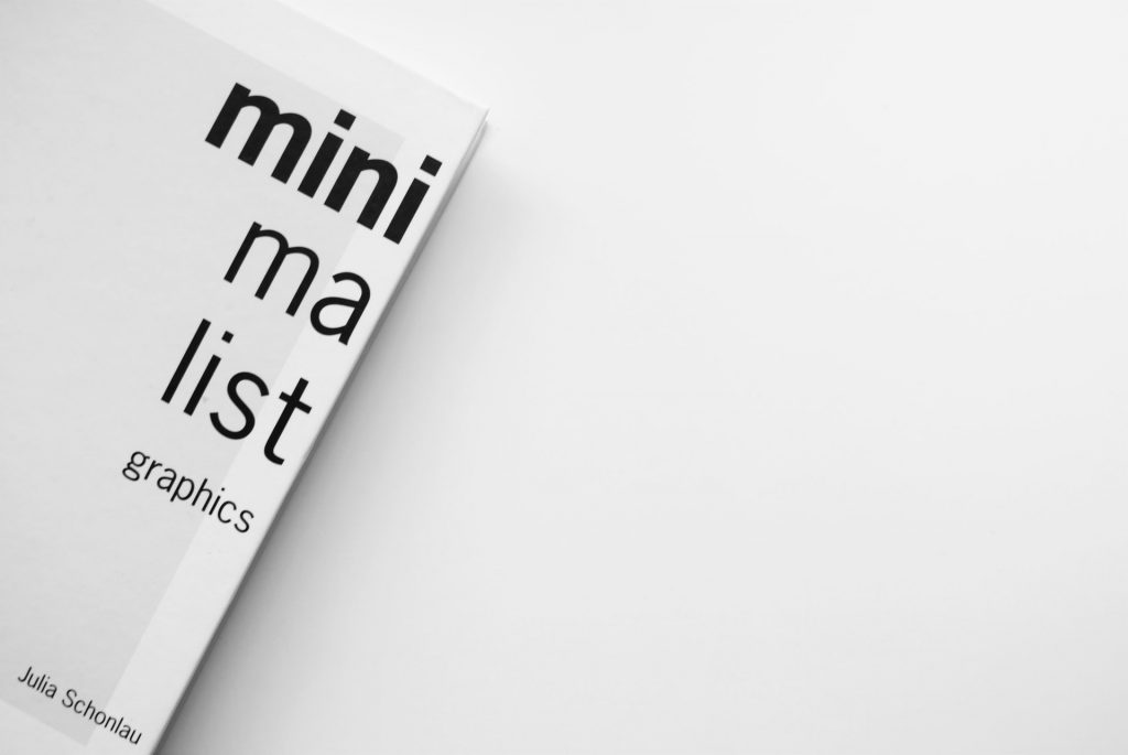
Whether your target markets are boomers aged 55 years and above, or the younger Gen Z, one thing is for sure: you need to keep your flyer short and straightforward. In this generation, consumers get hooked on quick and accessible information.
Nowadays, the attention span of the average consumer is at least 8 seconds. This means your window of opportunity to grab your audience’s attention is low, let alone retain it. So, simplicity is key. Resist the urge to create abstract and unique patterns where the aim is to ‘stand out.
While that is well and good, it may be off-putting to the market you are trying to reach. Instead, ensure your flyer sparks your target audience’s interest without it being too overwhelming where it could potentially drive them away.
This is where it pays to have a good copywriter. Use bullet points and keywords. Avoid – at all costs – lengthy paragraphs and wordy explanations. The bottom line is to make sure that your flyer’s content is digestible to your target audience.
Ensure a Catchy and Relatable Headline
Have you ever received an e-mail or text message where they are promoting a product that you may or may not want? If so, how many times have you trashed that e-mail without even clicking ‘Open’? It’s because its headline is not worth your attention.
Understanding your audiences’ pain points gives you the best chance to become an influential designer and deliver an advert that generates conversion. It’s an added step for graphic artists or designers, as this is usually a copywriter’s scope and task. However, understanding your audience’s emotional strings is a great advantage when designing any promotional material.
Use a Template

Various outputs can be produced from a singular design; it can be a social media advert, e-mail campaign, billboard ad, or poster. Whatever it is, always remember the default output: that you are designing it for print.
Ensure you follow the output’s most minor specifications, such as the final product’s color profile (CMYK or sRGB), or incorporating the appropriate bleed lines and margins. Remember: the technical rules for designing a billboard is different from a social media post.
Whatever your output is, your starting design will continually evolve from a flyer, not from a billboard. While there are a handful of templates for graphic design, Venngage is worth checking out. It gives access to students, which makes it economical, dummy-proof, user-friendly, and best of all, it’s free, which is where utilizing a template comes in handy – it is more efficient and makes the design process much smoother.!
Don’t Forget to Include Your CTA
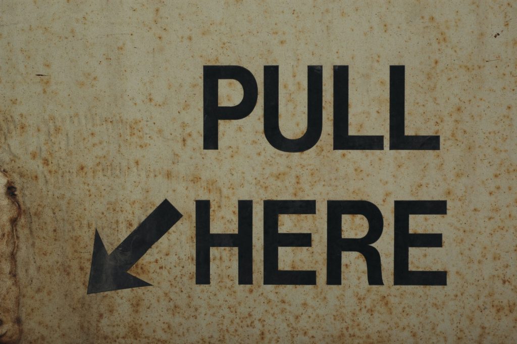
CTA is your Call To Action. As promising as your flyer looks, your target audience cannot take the next step if you do not include your Call To Action in it. This means getting your target audience or market to take a specific action from your provided information (aka flyer).
This can be from contacting your brand through phone numbers, e-mail addresses, or social media handles to giving a voucher to redirect them towards your product or services. Whichever CTA you choose to provide, its purpose is to engage your audience with your brand.
There is no specific rule or standard in having a fool-proof method in designing a visual that guarantees conversion. In a world where your final artwork’s objective is to initiate revenue heavily relies on your client’s branding, specification, market, and audience.